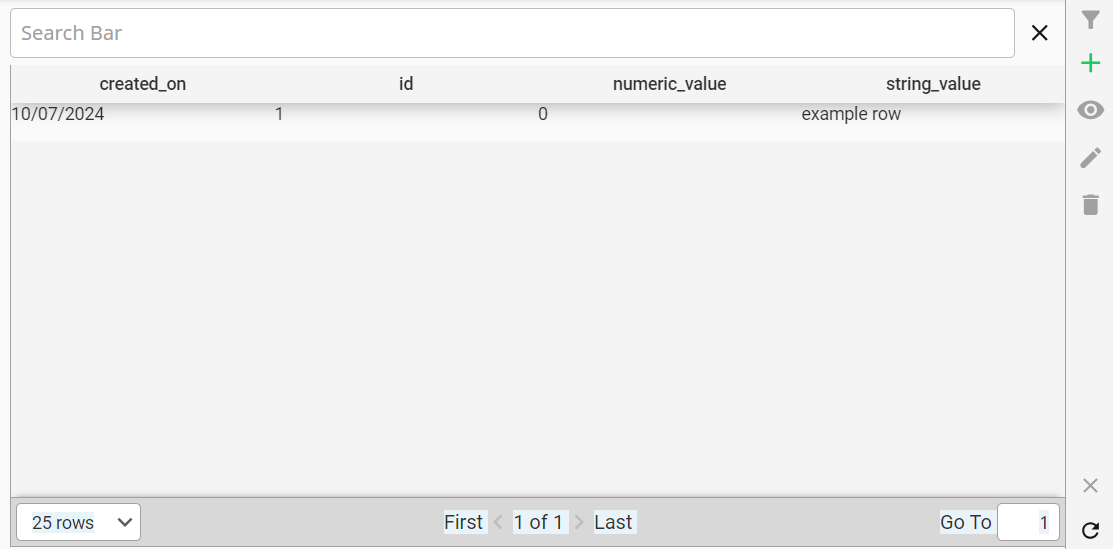
Table Display
Path: Exchange/Pika View/Component/TableDisplay/Main
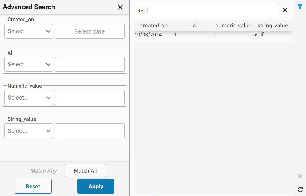
This View component is made to work with Pikaview to display records from a table, once metadata has been generated. The View also includes controls for common actions like Create, Edit/Update, and Delete. Includes both simple (via search bar) and advanced (via collapsible side panel) search modes.
Parameters
| Name | Type | Description |
|---|---|---|
service | dictionary | Points the component at a database table with an existing configuration. |
columns | list of dictionaries (Field) | List of specific columns to display on table. Refer to Common Json Types/Field for more detailed info. |
filterDict | dictionary (Filter) | The default filter to apply to the data for the table.
See Common Json Types/Filter for more detailed info.
Any filter defined here will be additive with filters applied via the Simple Search and the Advanced Search options. |
joinsList | list of dictionaries (Join) | A list of joins to use when querying data for the table, in order to bring additional columns into the dataset. |
orderDictList | list of dictionaries (Order By) | A list of order by clauses to sort the data returned to the table. |
| selectedData | dictionary | The selected row of the table (requires that the table be selectable, see Additional Options to see selectable flag for more). |
options | dictionary | Additional configuration options for the table that controls pagination, searching, side bar actions, etc. |
Additional Options
| Name | Type | Description |
|---|---|---|
| Selectable | boolean | Controls whether the rows of the table are selectable. |
| Paginator | boolean | Controls whether a paginator is used for the table (see Paginator). |
| Search | dictionary | Controls whether Basic/Advanced search options are displayed for the table, and configures each. See Search for more information. |
| Actions | dictionary | Set of boolean flags that controls if the corresponding button appears on the side bar. |
Message Handlers
This component makes use of message handlers for some functionality. Most of these message handlers are used internally and automatically, but some can also be triggered externally in order to force certain events, such as refreshing the table data.
exchange-pikaview-searchPanelClose
Triggered automatically when the included Advanced Search Panel is closed. This is used to control the visual state of the Toggle Advanced Search button.
No payload is expected.
exchange-pikaview-table-refresh
When triggered, forces the table data to refresh. This message handler is called automatically in certain situations, like if the included Advanced Search Panel's state changes or when the refresh button is clicked, but can also be triggered externally to force a refresh.
# payload is meant to describe relevant Table Components as determined by configuration
{
    'schema': str, # the table's configured schema
    'tableName': str # the table's configure db tableName
}
exchange-pikaview-record-deletion
Triggered by the Delete Row button's confirmation popup. This message handler will delete of the record described in the payload. This message uses a hidden internal 'viewId' as part of its payload, so it would not be feasible to trigger this externally.
# payload is meant not only to pass a recordId to be deleted, but also
# to describe a specific table component on the screen to avoid
# the case where multiple table components on the same screen could
# attempt to delete multiple times
{
    'viewId': str, # the unique key of the table that is meant to receive the message
    'schema': str, # the table's configured schema
    'tableName': str # the table's configured db tableName
    'recordId': any # the primary key of the record to be deleted
}
Usage
Common Actions
Toggle Advanced Search
- Clicking the Advanced Search icon will toggle the advanced search panel on the left side of the page
- See the Advanced Search documentation for more information.
Add Row
- Clicking the Add Row icon opens a popup to enter information for a new row to be added on the table.
View Row
- Clicking the View Row icon opens a popup to view the selected row in a read only mode.
Edit Row
- Clicking the Edit Row icon opens a popup to edit information for the selected row.
Delete Row
- Clicking the Delete Row icon opens a delete confirmation popup, that will delete the selected row after confirmation.
This action cannot be undone.
Clear Selected Row
- Clicking the Clear Row icon will clear the currently selected row on the Perspective table component.
Refresh Table
- Clicking the Refresh icon will refresh the data inside of the table.
The Add, Edit, and Delete row actions are only available on table objects.
Examples
Simple Table
This example displays a table pointed at a certain table with a simple configuration, meaning no pagination, no search options, and no sidebar actions enabled.

{
    'columns': null,
    'filterDict': null,
    'joinsList': null,
    'options':{
        'Actions': {
            'add': false,
            'delete': false,
            'edit': false,
            'view': false
        },
        'Paginator': false,
        'Search': {
            'Advanced': {
                'enabled': false,
                'fields': []
            },
            'Basic': {
                'enabled': false,
                'field': null
            }
        },
        'Selectable': true
    },
    'orderDictList': null,
    'selectedData': null,
    'service': {
        'configId': null,
        'schema': 'PikaviewTesting',
        'tableName': 'pika_test1'
    }
}
Specific Columns Displayed
Below is an example which uses the columns parameter to configure only a single column.

{
    'columns': [
        {
            'columnName': 'string_value'
        }
    ]
}
Initial Filter Defined
This example shows a table that utilizes the filterDict to specify an initial filter.
{
    'filterDict': {
        'field': {
            'columnName': 'string_value'
        },
        'comparisonOperator': 'LIKE',
        'comparisonValue': '%ASD%'
    }
}
Search Setup
This example shows a table that has both Basic and Advanced Search options configured.
{
    'options':{
        'Actions': {
            'add': false,
            'delete': false,
            'edit': false,
            'view': false
        },
        'Paginator': false,
        'Search': {
            'Advanced': {
                'enabled': true,
                'fields': []
            },
            'Basic': {
                'enabled': true,
                'field': {
                    'columnName': 'string_value'
                }
            }
        },
        "Selectable": true
    }
}