Other
Paginator
Path: Exchange/Pika View/Component/TableDisplay/Paginator
A component that provides UI controls for pagination, including displaying the current page, calculating total pages, and buttons to change pages. This component is included in the Table Component. This component doesn't do any querying itself, and needs to be given the total number of rows initially.
The component features a Dropdown to change the page size and arrow buttons to change pages. Additionally, there are "first" and "last" buttons to jump to the beginning and end of the page range, as well as a "Go To" text box to quick jump to a specific page.

Parameters
| Name | Type | Description |
|---|---|---|
| currentPage | int | Current page of pagination, calculated by the component based on total rows, page size, and user input. Input/Output parameter, can be used as a part of a "LIMIT/OFFSET" or "TOP" SQL query to enable true pagination. |
| pageSize | int | Number of rows to display per page. Can be changed by user via dropdown. Defaults to 25. |
| totalRows | int | Total number of rows being paged. Needs to be supplied externally. |
Sanitized Textbox
Path: Exchange/Pika View/Component/Other/SanitizedTextbox
A string input field that is used instead of the default Textbox because it has the ability to remove disallowed characters. These characters are defined in exchange.pikaview.settings.disallowedCharacters. The goal is to provide a more secure way to allow user input while preventing the injection of malicious strings.
This component is used by the Add/Edit Form, Search Bar, Advanced Search Panel and more.
Parameters
| Name | Type | Description |
|---|---|---|
| align | string | String of how to align the text in the Textbox. Defaults to "left". |
| enabled | bool | Boolean flag to allow input into the Textbox. |
| placeholderText | string | Text to display as a placeholder in the Textbox. |
| value | string | The current value of the Textbox. Input/Output parameter. |
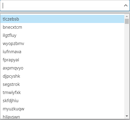
Dropdown
Path: Exchange/Pika View/Component/Other/Dropdown
A Dropdown component that is meant to work with a Pikaview configuration database table, and automatically retrieves records to be displayed as options. The Dropdown automatically supports text searching for options based on the displayField parameter.
Parameters
| Name | Type | Description |
|---|---|---|
| config | dictionary | Config options for the Dropdown. |
| enabled | boolean | Boolean flag which controls if the component is enabled or disabled. Defaults to |
| inputValue | any | The initial value of the Dropdown. The datatype should match that of the column defined in config.keyColumn. Defaults to null. |
| minimumSearchStringLength | int | How many characters the user needs to type when searching before a query is made to retrieve results. Values greater than 0 will stop all querying if the search string is too short. It is suggested to adjust this value for tables that have many results, otherwise searching could be non-performant. Defaults to |
| outputValue | any | The output value of the Dropdown. Datatype will match that as defined by |
| readOnly | boolean | Boolean flag which controls if the component is in "read-only" mode or not. In read-only mode, the Dropdown ceases to be an input at all, and instead displays the text contained in the |
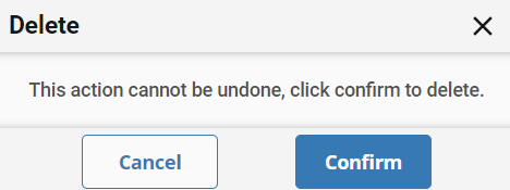
Delete Confirmation
A Popup Confirmation that ensures the request to delete a record is verified by a user before completing. This is used by the Table component when deleting rows.
Parameters
| Name | Type | Description |
| service | dictionary | Dictionary which controls the Service (Table/Schema) which will do the deletion. |
| formviewId | string | Used by the Table component to relate the Popup to the Table component. |
| itemId | any | The primary key of the item to be deleted. Datatype should match that of the primary key column of the Table configuration in |
| itemType | string | The display name of the record type to be deleted. Used in the header of the Delete Confirmation. |